Wednesday, 20 March 2013
"living is easy with eyes closed"
My quote that I am creating imagery for this week is "living is easy with eyes closed" -John Lennon.
Mind map
Mood board
3 thumbnails
Tuesday, 5 March 2013
Bauhaus Scavenger Hunt
As I was doing other work when I realized how everything around me was a bauhaus design.
The following are furniture, household items and an exterior:
Wednesday, 27 February 2013
Constructivism: Cory Scheider Edition
I created this constructivism poster to help the Canuck hockey fans who have not made up their minds about which goalie they prefer. If you are a Canucks fan, you know there is a large discussion around our goalies. Our number 1, being Luongo; a fantastic goalie closer to the end of his career then the beginning. Then we have Schneider; a 26 goalie wanted to shine in the spotlight. He started shaky on his first game, but since the lockout most players are. Unfortunately being a goalie being rusty is a lot more apparent. Schneider can take the heat and is excellent in shoot outs. I could go into his statistic details but that might take a while. Instead I will let you bask in the glorified Schneiderman!
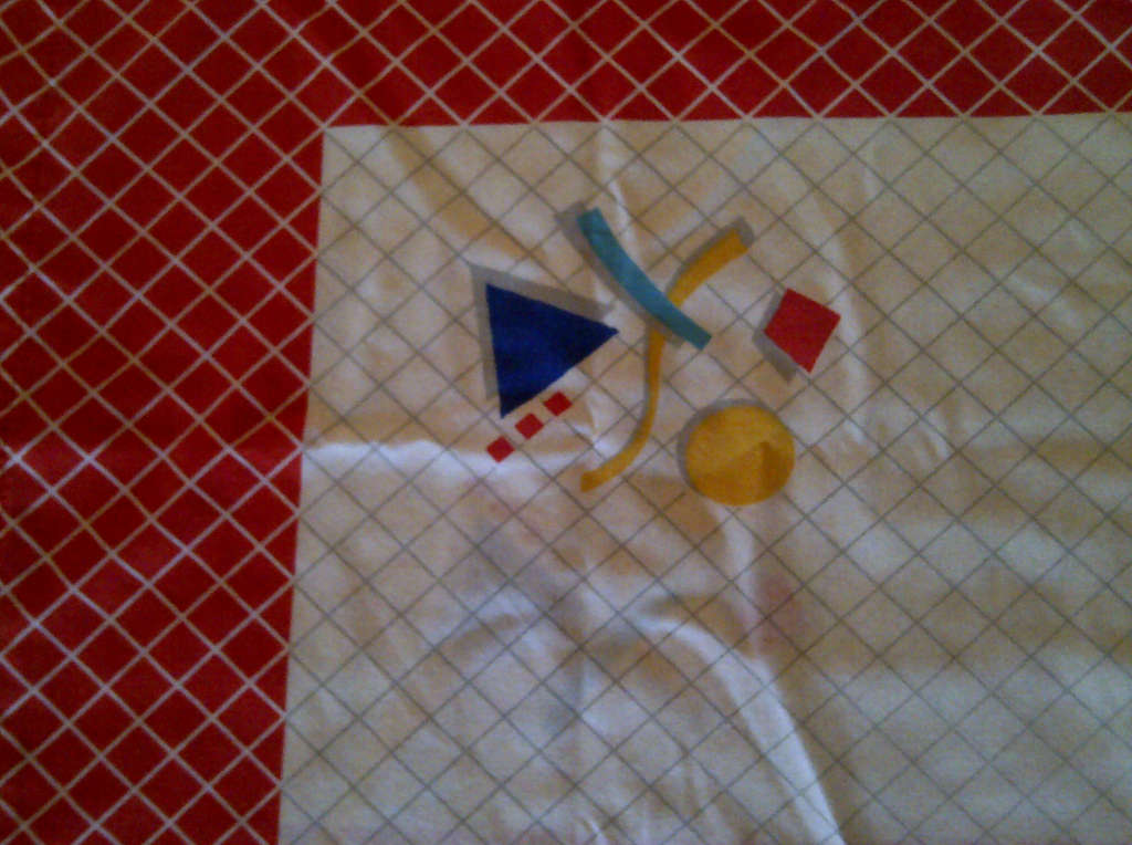
The images below are from the from finished product through my process to mind map. I wanted to use textures that are associated with hockey for example: hockey tape, stick tape, and ice that has been skated on. Luckily found the type of font that the Vancouver Canucks use. Originally I wanted to hand cut out all of my objects but I couldn't find any magazines that have Cory as the main focus. Also trying to find an image in which Cory was in focus and without his helmet was nonexistent. Therefore I airbrushed his whole face to make it non pixelated while trying not to over do it. Also in my original design I had more elements but to convey my message clearer it was simplified. In my research for constructivist style I was finding the compositions were diagonal rule of thirds so I used that as my composition as well.
Tuesday, 5 February 2013
A Nickel For Your Thoughts?
Now that the penny is out of circulation; using the phrase "a penny for your thoughts" wont be applicable.
The price for your thoughts has soared 500%, but have your thoughts risen that far too?
Wednesday, 30 January 2013
Art Nouveau Soap Box
This art nouveau soap box design was inspired by mainly the beautiful woman with the long locks. With the wispy hair and elaborate boarders that make this period so iconic and memorable; I wanted to capture this on my box. My brand is called Savon De Sierra. I am not fluent in French so not sure if I translated that one correctly ( meaning Sierra brand Soap). I didn't choose the name solely it being my name, but because of the Sierra Mountains Range; which is rendered in the background. I was inspired by the Mucha job cigarette papers poster from 1898 for the woman's hair. I was also inspired by the Mucha Monaco Monte Carlo poster from 1897 with the mesmerized female and the stylized plants, I made vines flowers and lilly pads into a frame. The type that i made was inspired by the Mucha poster for the french commerce ministry exhibit in 1904.
Wednesday, 23 January 2013
Victorian matchbox
My inspiration for this design was to incorporate the busy text that many posters applied during the Victorian era. Although with technical difficulties and size challenges I was only able to achieve the necessities. I challenged myself by only using black and white with a textural mid-tone.
Now I have a new appreciation for delicate flourishes.
Saturday, 12 January 2013
Design Inspirations
As an illustrator, my favourite artistic movement is Art
Nouveau. I adore the organic intricate frames and women’s hair that Art Nouveau
is infamous for. Art Nouveau’s embellishment style is extremely entrancing. I
spend a vast amount of time studying the line work and I enjoy how it takes me
on a fun journey inside paintings or architecture.
Adam Hughes
Princess Leia
http://adamhughes.deviantart.com/
Olly Moss
Olly Moss
Return of the Jedi
http://www.ollymoss.com/galleries/posters
Olly Moss (25) is a designer who is in the thick of the
industry; with a client lineup from Lucas Films to Nike to Apple. Olly creates extremely
clever designs. Many of his designs are optical illusions, making his art
memorable. By only using what is needed Olly has great white space usage. As a
Star Wars junkie, I appreciate the work he did for Lucas films. With only 1
colour with black and white Olly used iconic character silhouettes to frame
scenes from the original trilogy. When it comes to design, I agree with Olly’s
approach that the layout should only have a few colours in it; otherwise it is
too overwhelming. I believe all design should be appealing in black and white
but be able to use colour to only enhance it. Olly moss is a great designer
that upholds a strong portfolio with out over colouring.
Subscribe to:
Posts (Atom)